About Me

My photo
Hi welcome to my blog! this is intended to be a reflective learning journal for my participation in the OCA BA Photography degree: The Art of Photography

Friday 10 August 2012

Monitor Calibration


I decided to revisit the calibration of my monitor. I started off checking the information which came with my desktop - and going through the on screen instructions.  I looked up a few things on the internet (see http://www.cambridgeincolour.com/tutorials/monitor-calibration.htm ), and also Adobe.  I went through the on screen instructions with adobe - but still was not overly impressed with the results.  I do need to invest in a monitor calibration system which you sit on  the screen.
In the intermin, I found quite a good online calibration software which was good for windows/pc: see http://www.calibrize.com/.   I am quite happy with the results, but it will be interesting to have the additional hardware to sit on the screen and re-calibrate. I would like to reproduce the colours I see on the monitor in print.  The following link, outlines a discussion on hardware devices -  I have yet to decide on one.  I will add more to this comment, when I have done further research.

http://www.thephotoforum.com/forum/photography-equipment-products/&rct=j&sa=X&ei=E6AkUMXnIIKsiAfg7IG4BQ&ved=0CHoQ6QUoADAH&q=hardware+monitor+calibration+device&usg=AFQjCNGLXfwB60ZEuIGopFKuitaC0NuxUA

Thursday 9 August 2012

Photographers


Every time I pick up my camera, I have been questioning the process of "composition".  Literally (except for in a studio) photographers cannot compose images per se, instead, they do the best they can with the available scene. Often elements of a scene are in fixed relationships to each other. To make it appear that these elements are in different positions relative to each other - a photographer makes use of: viewpoint, aim and the use of framing - i.e., creating a favourable composition.
Interestingly, I have just read about Eric DE Mare, who was an architect, photographer and writer. He studied architecture from 1928 to 1933, (becoming the editor of the Architects Journal in 1943). His particular speciality focused on traditional, functional and industrial structures. His writings were accompanied by photographs of industrial buildings and engineering structures. He looked for the artistic effect in large industrial buildings, looking for geometry (cf:Henri_Cartier-Bresson below). De Mare, observed that composition is an essential part of a good photograph; photography as an art, has no meaning without it.   He summed up his philosophy as: 
"The photographer is perhaps the best architectural critic, for by felicitous framing and selection he can communicate direct and powerful comments both in praise and protest. He can also discover and reveal architecture where none was intended by creating abstract compositions of an architectural quality"(1)

© English Heritage.NMR
  Reference Number: AA98/06908

The abstract quality, is evident in this photograph of  the Queen Elizabeth Hall and Purcell Room on the South Bank, London (opened 1967). The composition of the frame and cropped image of curves and diagonals highlight the abstract effect of the building. I have endeavoured to replicate this with my own images when shooting architecture, using  a telephoto lens and sometimes canting the frame, I can achieve an abstract effect.

© English Heritage.NMR
Reference Number: AA98/05961

Here the juxtaposition of the modern  high-rise Millbank Tower, with the neo-Classical portico of the Tate Gallery creates an effective contrast in subject matter.


© English Heritage.NMR
Reference Number: AA98/05351

  In 1958 DE Mare, published London's Riverside: past, present and future.   This is a photograph of St Mary Overy Dock in the 1950s - when London was still one of the busiest ports in the world. Now, this area has been gentrified and I guess that in itself is a contrast!

© English Heritage.NMR
Reference Number: AA98/05429

De Mare's Photography and Architecture (1961) (2) demonstrated one way in which art and architecture met. It sought to teach people to 'understand, love and enjoy architecture' by using their cameras. The photographs use unusual viewpoints and lighting to create an artistic ambiance and effect.   De Mare looked


This photograph of St Pancras Station has a magical quality, and the use of light softens the building - again giving a contrast of soft light with the darkness of the imposing building. I adore this shot!  I used to live in Islington - this photograph conjures up so many memories for me (now I am devoid of City life, immersed in the mini-tropolis of a small town suburb in New Zealand - the exact antithesis of my life in London).  I truly wish I had discovered photography whilst living in London - so much to do and discover.

(1)http://viewfinder.english-heritage.org.uk/story/slide.aspx?storyUid=73&slideNo=9(accessed 9/8/12)
(2) Eric de Maré, Photography and Architecture (1961) Penguin books;
http://viewfinder.english-heritage.org.uk/search/results.aspx?index=0&form=advanced&who=de%20Mare
http://en.wikipedia.org/wiki/National_Monuments_Record_(England)
Higgott, Andrew, Eric de Maré : Photographer, Builder with Light. London : AA Publications, 1990. ISBN 1-870890-28-0

Henri Cartier-Bresson:

"To take a photograph is to align the head, the eye and the heart. It's a way of life." (1)
No study of photography would be complete without a mention of Henri Cartier-Bresson, one of the greats! Henri Cartier-Bresson (HCB) has been dubbed the master of the moment or the godfather of  street photography.  He had an exceptional life and was a truly remarkable character even before becoming one of the worlds foremost influential journalistic/documentary photographers (a tag which he did not particularly like). 

As a young boy HCB used  photography to augment his drawings, stating that photography was  a way of documenting a sketch -  i.e., an immediate sketch.  Geometry in all things, was of paramount importance to HCB. For him photography was about developing one's awareness and sensitivities, ready to catch the decisive moment. HCB had an ability to use the camera as an extension of his body, not thinking, but just capturing a moment in the time. He said the camera is a way of sharpening the way you feel.   I found an interesting documentary :Henri Cartier-Bresson: The Decisive Moment , which gave a worthwhile insight into the man, and is rewarding to watch.


SPAIN. Andalucia. Seville. 1933
Image reference:
PAR45088
(HCB1933005W00004C)


© Henri Cartier-Bresson/Magnum Photos


It is amazing to see the geometry in the patterns and shadows reflecting off the wall. The contrast of light and dark is evident - but it is the boy in the shadows which makes the image haunting, prompting the viewer to question why he is there. Image courtesy of Magnum Photos: Henri Cartier-Bresson: Magnum Photos  (accessed 8/8/12)

 In this image, you can see the geometry in the composition, the curve of the road, the curve of the stairway, aligned with the diagonals of the wall, and in a split second the movement of the man on the bicycle.
PAR44919
(HCB1932001W0066BC)
© Henri Cartier-Bresson/Magnum Photos
http://www.magnumphotos.com/C.aspx?VP3=CMS3&VF=MAGO31_10_VForm&ERID=24KL53ZMYN


(1)http://www.magnumphotos.com/C.aspx?
 The above images are available for viewing on http://www.magnumphotos.com/C.aspx?VP3=CMS3&VF=MAGO31_10_VForm&ERID=24KL53ZMYN

http://www.youtube.com/watch?feature=player_detailpage&v=MW7I3GBdsBw
http://www.youtube.com/watch?v=YGKubZ1B07c&feature=related  (accessed 8/8/12 -  amazing to watch!)
http://en.wikipedia.org/wiki/Henri_cartier-bresson
http://www.henricartierbresson.org/vente/home_fr.htm

Tuesday 7 August 2012

Part One Review - Reflections on Compositon

Reflections on Composition:

Before moving on to the Cropping exercise, I thought it would be useful to reflect on a few points about composition and look at some general photographs that I've taken with the rules of composition in mind.
In this photo, I was mindful of the rule of thirds and wanted to place my son where he would touch on the lines, dividing the frame into the rule of thirds. He is off centre and placed in the lower right hand side of the frame, and crossing the mid, horizontal line. Ive attempted to retain, negative space in the rest of the frame. I think this image works well, it has plenty of dynamics going on, and is visually appealing.

In this image, I placed the boat in the top right hand side of the frame. Rangitoto Island, in the background provides a diagonal adding interest. I think this image works well, I did crop it however, as the Island, in full view, would have dominated the frame.

Here the lines direct the viewer's gaze to the distance and add a 2 dimensional effect to the image. Again, my subject is emanating from the lower right hand side of the frame. This is something I am to experiment with.

This is repeat of the above photograph. The yacht is in a slightly different position, ( I was travelling past it, on a passenger ferry) and the vignette effect helps to focus in on the yacht, adding a sense of drama.

Conclusion

I am growing in my awareness of placement within the frame. I used to photograph, with subjects dead centre which made for a dull static image... now I am consciously thinking about the dynamics of the frame, the various rules for dividing the frame, and the effect of vertical vs horizontal.

In the last few days, I thought I would revisit focal lengths and I in particular I set a task for myself which involved shooting images set to the widest angle i.e. shortest focal length which on my camera is 24mm. I wanted to see what effect a wide angel had on subjects at close range. I was particularly interested to see if I could achieve interesting distortions at close range.


I have managed to achieve some interesting distortions with subjects at close range - especially with architecture. The wide angel exaggerates or accentuates the perspective of the buildings. I would not usually have got this close up with a wide angel focal point, but here I think this focal length has produced dramatic results - which again is something to keep in mind when thinking about the frame and composition.

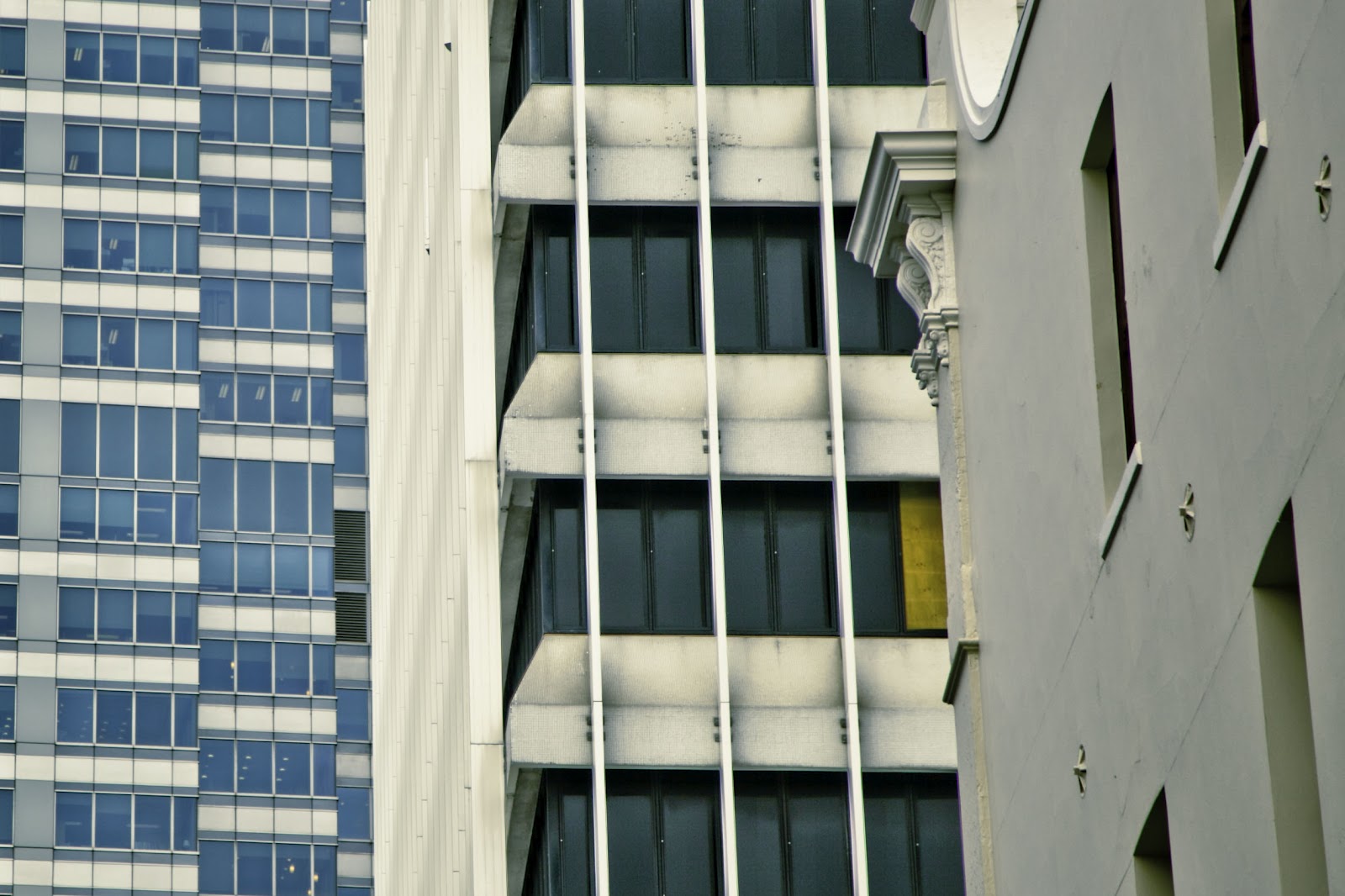
I repeated this exercise with my longest focal length, or telephoto lens. The longest focal length actually brings the subject closer. Telephoto lenses seem to distort in the opposite direction to wide angels.


It is interesting to see how the telephoto focal length, actually compresses the image. This is particularly evident in the shot of the building above - which looks flat. I quite like the abstract effect this gives to the image.

Exercise: Cropping

Cropping:

Cropping is an editing skill, and is often used to improve the composition of an image. For example, it can be used to fit an image to the available space - as we have seen in the exercise on placement and fitting the frame. I have used cropping as a design element in post production, especially when I have cropped images of urban scenes, the results tends to highlight shapes giving an abstract effect.

It is important to remember though, as Freeman states  cropping should not be an excuse for indecision at the time of taking a photograph - as "cropping introduces an interruption in the process of making a photograph, and most images benefit from continuity of vision"[20].

In this image, the first photograph is quite meaningless. However, cropping in gives an interesting dynamic view of the building bringing out the abstract effect in the vertical shot. I particularly wanted an abstract effect and cropping in on architecture, and canting the lens, can produce some great results.

Urban setting.


Field


When I choose this image to crop, I decided the main focus of attention would be the sheep in the foreground which stood out from the others.   Originally, when I took this shot, I was aiming to place the horizon high in the frame. I was also conscious of what we had learnt about placement in the frame,  and wanted to place the two sheep in the right hand upper side. In the end I decided on the final shot - purely because I find it quite humorous.

Path


 I took the photograph with the path in mind as my dominant element. I think the image works horizontally with both the path and the flower beds bending around the corner, adding a dynamic flow.  However, I wanted to separate out the path more so cropped it vertically.  It reminded me of something which I viewed recently [Brassai: Open Gutter, Paris, 1931 - see - http://www.atgetphotography.com/The-Photographers/BRASSAI.html (accessed 12 July 2012)].  Brassai, took night shots of Paris in the late 1920/30s.- which was amazing considering the technology of the day.


Conclusion:

As already stated, cropping is an effective compositional tool for post production.  I am constantly thinking about the Frame, and placement - earlier in my journal, I stated that composition is a very cognitive thing for me, and at this point in the course, I still have to focus very much on the elements of the frame and placement.  As a rule, I do not go out, and photograph with cropping in mind. It is very interesting to see the images, and the effect cropping has in changing the dominant element.

Freeman, Michael, (2007)The Photographer's Eye: Composition and Design for Better Digital Photos (2007) The ILex Press