About Me

My photo
Hi welcome to my blog! this is intended to be a reflective learning journal for my participation in the OCA BA Photography degree: The Art of Photography

Thursday, 20 September 2012

Exercise Diagonals.


Exercise: Diagonals

We were asked to take 4 photographs which use diagonals.  One thing I have noticed whilst doing this exercise, is that it is easy to create diagonals by canting the frame.   Diagonal lines produce movement, dynamism .. they are highly active.. and bring life into the picture because they represent unresolved tension (1).


1. there are parallel diagonals here, the branch going left to upper right and the individual leaves forming diagonals off the branch.

2. again in this image, depending on the cant of the frame, parallel diagonals (I have tipped the frame slightly to highlight the contrast of vertical and diagonal).


3. movement is present, the columns form diagonals in one direction, whilst the top diagonal line of the building pulls the eye in another direction demonstrating unresolved tension.

4. I spotted this diagonal shadow forming across the bottom of the statue -
5. the staircase is a natural diagonal, I originally canted the frame to get an abstract view of the tower, in doing so, the tower itself creates a diagonal suggesting movement, perspective and depth.


Conclusion:

Horizontals and verticals  lines produce stability which arise from their symbolic associations with gravity. Diagonals have a stronger sense of movement and expression.  As I experienced in this exercise, diagonals can be created in the viewfinder by canting the frame - as Freeman notes, this ability means that they are much more under the control of the photographer(2).   Diagonals emphasise depth and distance, I have looked back through the early exercises in Part One, and noticed that I had quite a few diagonals emphasising depth and distance. I am now able to appreciate that diagonals form strong graphic points of reference, or movement.
Reflection:  whilst, participating in these exercises, I have been inspired to read about Cubism and its response to the Renaissance order of painting. I have always liked Mondrian, especially his later works, with lines and three colours. I am now able to understand a bit more about the graphic qualities in his drawings.  http://www.theartstory.org/artist-mondrian-piet.htm, and http://www.moma.org/collection/provenance/provenance_object.php?object_id=79879.


(1)Freeman, Michael, (2007). The Photographer's Eye: Composition and Design for Better Digital Photos, The Ilex Press. p 76 -77
(2)Freeman, Michael, (2007). The Photographer's Eye: Composition and Design for Better Digital Photos, The Ilex Press. p 76 -77


Tuesday, 18 September 2012

Part Two: Black and White

Converting to black and white:

As recommended by Freeman in Part Two of the course materials at page 71, it may be helpful to tackle this part of the course in black and white. The rationale is, that our attention is more focused on the graphic elements of the picture when the image is shot in or later transferred to black and white. As you can see with my exercise on single points, the greenstone is very vibrant, and the colour itself (although  it serves as a point) a monochrome image would help the viewer to focus more on the graphic elements in the composition.
 
I never actually set out to photograph in black and white, but occassionally,as a post production strategy convert colour to grayscale. A well crafted black and white image tends to bring out the tones, contrasts, and is much more dramatic than a colour shot. Freeman(1), in http://thefreemanview.com/observations/when-black-and-white/(2) -  gives a quick overview about when to use black and white. I think the main point too, is to shoot in colour and then convert to black and white otherwise the camera's processor will throw away valuable information that you could use to edit your image.
For example, I am working with Camera Raw and I alter the hues/saturation channels before converting to grayscale.  At the moment I am merely experimenting with what looks good. 
 
 
Some of my images which have appeared extremely dull (shot on a grey day) have been more effective once converted to black and white. I guess it is the sense of drama. I am not too certain though, that I have mastered the technique of getting the right blend of tones when I adjust my colours before converting to grayscale. I guess it a matter of personal preference but I need to do some online research into the various techniques for adjusting tones.
 
I converted this photograph of bamboo to black and white, and in doing so, the contrast of tones really stood out. The colour image was fine, but the verticle lines stand out more in black and white.


This is a photograph by Toshihiro Oshima which I accessed from http://www.digitalrev.com/article/toshihiro-oshima-virtuoso-of-visual/NTY4NA_A_A. (accessed on 8/9/12)   His black and white work is amazing, full of drama and very soulful. This composition highlights the contrasting tones of the white kimono and the shadowy background.
 
(1) Freeman, Michael,(2007).The Photographer's Eye: Composition and Design for Better Digital Photos, The Ilex Press, page 126
(2)http://thefreemanview.com/observations/when-black-and-white/ (accessed 7/9/12)

Exercise Horizontal and Vertical Lines

Exercise: Horizontal and Vertical Lines.


Lines have a stronger graphic qualities than points.

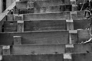
Here we were asked to look for specific examples of horizontal and vertical lines.   Looking back through my images, I noticed I have many verticals and diagonals, but not too many isolated examples of horizontals.  Here I have tried to isolate the horizontal, i.e., subordinate the content of the image to the line.


1.  Here you can see the horizontal line of the grass, and then the top of the sign (the vertical line of the post, actually makes this image a  more dynamic).

2. I went for a walk and saw this sign and immediately thought of the horizontal lines of the frame. The actual top and bottom of the frame form horizontals along with the actual lines on the sign.
 
3. Here you can see the horizontal  line at the edge of the sand, then in the background there is the  horizon which forms the second horizontal line.  I chose this image because I wanted to highlight the number of horizontals which surround us in everyday. As Freeman states [1]  horizontals are more static than verticals and because our own frame of vision is horizontal, the horizontal lines are visually more comfortable. 
 
 
4. The rough  wooden steps make interesting horizontals.
 
I particularly liked the horizontal grain on the wooden board walk shown in this photograph.  Just goes to show you that lines are absolutely everywhere.


Verticals


1. Vertical lines, on a shipping container (which had been made into portable toilets). I was drawn to initially to the uniform shape of the container, then to the vertical lines on the container itself.

2. vertical lines are visible on the sides of this 3-D poster board.  This was a very bright image, but in black and white, it serves to highlight the vertical lines on the sides of the display. The fixture contrasts nicely with the background.

 3. vertical lines in the form of pipes on the outside of this gas tower. I like the contrast of vertical and circular here. The image is dynamic the circles pull the eye one way and the vertical direct attention another, upwards.


4. the railings are vertical lines - I found a  small grave yard, and this fence caught my eye. Initially, I was caught by the contrast of the rusty railings and the growth of the grass on the grave. I have closely cropped the photo to give greater effect to the vertical lines.
 
In conclusion:
 
Horizontal and Vertical lines have a much stronger graphic impact than points  they: (i) divide the frame and (ii) direct the viewers gaze around the frame whilst having a more dynamic quality.  As Freeman states at page 77 of the course materials, the frame of a photograph has vertical and horizontal sides, the eye uses these as references and it is easy to detect any tilt in the lines of the picture. Horizontal lines are more static and comfortable, they "express stability, weight and calm" [2]  and do not require as much explanation as vertical lines. Vertical lines  have a stronger sense of movement, they add drama to an image and somehow have stronger vectors carrying the eye in a dynamic movement.
 
I actually re-read some of the early chapters in The Photographer's Eye[3] - and it was easier this time round to digest some of the information on placement, dividing the frame and horizon. I think the exercise on points has helped to absorb the concept of movement, division and placement.  Sitting on top of this, is the principle of dividing the frame and the various principles which advocate the various proportions or rules, on which the frame is divided.   I think the exercises on graphic elements are helpful in understanding the basic principles we looked at in Part One. It is always worthwhile revisiting the basic elements, each time I hope to glean something new from this practise. 


[1] Freeman, Michael,(2007). The Photographer's Eye: Composition and Design for Better Digital Photos, The Ilex Press, p,72
[2] Freeman, Michael,(2007). The Photographer's Eye: Composition and Design for Better Digital Photos, The Ilex Press, p,72
[3]Freeman, Michael,(2007). The Photographer's Eye: Composition and Design for Better Digital Photos, The Ilex Press


Other examples - although the concrete blocks form a repeated pattern, they also resemble vertical lines.
Here the vertical line of the edge of the wall, dissects the image and directs the gaze along its length. Interestingly, the shadows in the background, are both vertical and diagonal.