Unfortunately, computer problems have prevented me from adding to my blog for the past week. In retrospect however, I have been taking many photographs for Assignment 1 with "contrasts" in mind.
Preparation:
Assignment 1 background reading:
Assignment 1 deals with Contrasts - contrasts between all qualities - before embarking on this course of study, I was unaware that the elements of design were influenced by
"contrasts". As Freeman states
"contrast" is one of the most fundamental principles in design
(the other being balance) and this principle has its roots in the design theory espoused by the
Bauhaus.
I began my research by looking at the definition of
"Bauhaus" which I found on the following link:
http://www.metmuseum.org/toah/hd/phbh/hd_phbh.htm (accessed 7/8/12). Bauhaus is based on the concept of the medieval cooperative of artists and craftsmen who combined their talents to build the great cathedrals of the day. The Bauhaus school "sought to bring together the fine and applied arts, human ingenuity, and modern technology in order to help construct a new rational, egalitarian, and ordered society
"(1).
In reading about the history of the Bauhaus I was fascinated to read that it emerged as one man's response the to horrors of WW1. By way of background: The Bauhaus was the concept of Walter Gropius, a young German architect (later one of great visionary thinkers of the 20th Century), Gropius served in WW1, witnessing the horrors and devastation that War had to bring. This had a profound effect on Gropius, who responded to the apocalyptic chaos with an idea to "start again from zero". His rationale was that only a new outlook for society based on design and architecture could provide the means for a shattered civilisation literally to rebuild itself - as a result the Bauhaus was created.
The character of the Bauhaus was influenced by the Johannes Itten. It was Itten who, as Gropius's "master of form", invented the Bauhaus's most lasting contribution to art education, the Vorkurs, the preliminary training course in basic forms, textures and colours for all students entering the school. (2)
Itten devised a strategy to help students at the Bauhaus explore their potential for creative expression. He developed the idea that being aware of contrasts would help students creatively. He listed 27 contrasts which he used to develop and introduce creative composition. For example: contrast between light/dark, long/short, thick/thin. Itten thought it was fundamental that his students experienced these contrasts with their senses. Freeman(3) points out that there are three categories, first, those that focus on image qualities such as brightness, focus (as in sharp and unsharp) colour (eg chiaroscuro and highly saturated colours) and time (stillness and motion blur); second, surface qualities such as texture, transparency, solidity and thirdly contrasts within the subject itself, for example human emotions, Nan Goldin springs to mind with portrayal of close friends, in the powerful series: The Ballad of Sexual Dependency(4).
I have been mindful of the above three categories whilst compiling my shortlist of photographs for Assignment 1 and I am conscious that I am developing an awareness for the variety of contrasts which exist in everyday life:
Before embarking on Assignment 1, we were required to make a selection of four contrasting pairs from photographs, previously taken (during Part One of the course). The selection process has been good practise for me:
many/few
black/white
liquid/solid
straight/curved
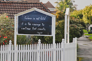
I have actually found the preparation rewarding in terms of forcing me to focus more on my choices of contrasts. It is quite a hard task to whittle them down and I do I often feel as though I am over analysing matters. I still don't feel as though, the elements of design come naturally - just yet!! Although, I feel I have gained insight into some of the fundamental principles of composition. This reminds me of something I saw recently on a notice board outside a Presbyterian an Church.. I kept thinking about this sign - so I decided to photograph it.

In the next few days, I will be compiling my final choices for Assignment 1. I have kept a notebook with me over the past few weeks. This has been useful for reflecting on why I wanted to take certain shots. It was also useful to carry this around, even when I didn't have the camera on me, as it was great to draw something I had seen, and then later return to it, with my camera. I did this a few times - and now I always carry a small note pad with me. (Ive definitely turned into a geek! or at least thats what my family think of me.)
I am also hurrying to finish the "Photograph as Contemporary Art" - and will continue my summary of this, once I have completed the assignment.
(1)Freeman, Michael, (2007). The Photographer's Eye: Composition and Design for Better Digital Photos, The Illex Press.
(2) http://www.guardian.co.uk/artanddesign/2012/apr/27/bauhaus-art-as-life-barbican (accessed 1 August 2012)
(3) http://thefreemanview.com/observations/composition-contrast-and-the-bauhaus/#(accessed 7/8/12)
(4) see- http://iconicphotos.wordpress.com/2009/08/12/boy-with-toy-hand-grenade/ (accessed 7/8/12)
Further reading: outlining the elements of contrast and the visionary focus of the Bauhaus.
http://www.oxfordartonline.com/public/page/lessons/Unit4Lesson3 (accessed 7/8/12).


.jpg)


