About Me

My photo
Hi welcome to my blog! this is intended to be a reflective learning journal for my participation in the OCA BA Photography degree: The Art of Photography

Tuesday 2 July 2013

Project Shapes


Exercise: Real and Implied Triangles.

Lighting is everything! I have been reading Drawing on the Right side of the Brian (1) and my awareness for form has increased.  A shadow can define a line or shape - shading of an area can outline a perceived shape in our minds and look like a line or form an shape.

In the introduction to this project, Freeman, in the course materials at p 87 states that "A shape is both an outline and an enclosure, ....the extent to which it appears as one or the other depends very much on the subject and the lighting. Shape...defines and object, but it can also be implied in much the same way as a line can".
In this exercise, we are asked to produce two sets of triangular compositions on using "real" triangles, the other using "implied" triangles.


Real Triangles


Photograph 1.   I found this replica of a Chinese workman's cottage situated in Arrowtown, South Island New Zealand and thought this represented a real triangle.   The roof forms the apex and the sides and floor complete the rest of the triangle.


Photograph 2. Here there is a triangle converging towards the top of the frame  in remnants of this medieval cathedral in Chester.


Photograph 3. The inverted triangle is evident in the shape in the negative space. 


In this image, the lilly forms the shape of the inverted triangle.


(1) Edwards, Betty, (1993): Drawing on the Right Side of the Brian: How to Unlock Your Hidden Artistic Talent, Harper Collins

Tuesday 16 October 2012

Photoshop


Photoshop - beginners course.


I have taken a very short break from my blogg and continuing with the OCA Part Two, this is due to me completing a quite intense Photoshop course which is due to end in two weeks time.  At the moment, I am putting a portfolio of images together, which will hopefully display the skills that I have learnt over the past 3 months.

I must say though - Photoshop seems to have overtaken my life...  this has been a great course but has been extremely demanding from a beginners point of view, and some of the tasks have been more appropriate for someone studying graphic design - not photography.  I have been creating "eye-balls" from scratch.. and manipulating images with puppet warp.   The course has been very useful, if some what very trying! and I now understand more about basic image management.

I am really looking forward to continuing with Part Two and Assignment Two - and should be back on line in 3 weeks.

Wednesday 26 September 2012

Exercise Implied Lines

Using Lines in Composition

As the previous exercises have shown, lines are a useful tool in composition and direct the viewer's gaze in the path the eye is intended to follow.    Implied lines work in the same way - the brain seeks to resolve the completeness of the line, and will naturally imply a line so the eye can follow a path.  In essence the eye and the brain are working together to resolve incomplete things.   An implied line is an example of Gestalt's Law of Good Continuation -  the brain implies a line to resolve its direction(1).   Essentially, the eye follows a line and it tries to construct or continue this from the implied surroundings or suggestions - and the stronger the encouragement, eg, diagonals and curves, then the eye will resolve or complete the flow of movement.


Exercise Implied Lines:

 This exercise is in three parts.
 
Firstly, we were asked to identify the direction of the implied lines in the following photographs.


Photograph 1: There are two distinct lines intimating motion. One moves up the bulls back and over the Matador and along the outstretched cape.  The other prominent line, flows down the back of the matador.    I have  looked at this image a few times, and can also see a circle at play, one which curves along the ground by the Matador and moves around up the bulls back and down the back of the Matador - this is a good example of Gestalt's law of Good Continuation at play. 


Photograph 2: Again, the eye seeks to resolve a line of movement for it to follow. Here, there are two distinct diagonals travelling up (or down) from the ground up each mule. Secondly, there is a curve which flows from the left hand side of the image across over the top of the mules, and up and over the farmer.  The gaze or eye line from mules towards the farmer is a good indication of the direction of the implied line. 
 
 
In the second part of the exercise, we were asked find three existing photographs and identify implied lines.
 
 
Photograph 1: The diagonal line is very strong in this photograph and dissects the frame, the other lines are implied by the directional gaze of the boys looking down into the stream. There is a sense of movement and flow in this image.

 
Photograph 2: Here there is an implied diagonal line which travels across the back of the ducks (the ducks are arranged in a diagonal line).  There is also an implied line from the eye line gaze of the ducks to the ground.

 
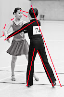
Photograph 3:  Here there are a number of implied lines, the diagonal lines travelling down the back of the boy to the floor and another diagonal down the boys arm.  There is an inverted triangle in the shape of the boys legs and an eye line in the gaze between the two children.  There is also a curved line, moving down (or upwards) the girls arm - this  curve is in contrast to the sharper lines of the diagonal and appears more elegant and smooth.


The third part of this exercise involved me taking the following two photographs which illustrate implied lines.

 
photograph 1. In this image, the implied lines are the eye line gaze from the small child to the toy. Our line of vision is immediately drawn along to the path of the child's gaze. Other lines which suggest flow and movement are the implied horizontal and vertical lines along the boys arm.  Considering the boy as a shape - I can see a triangle. Shapes are another element of design which we shall cover in the exercise.


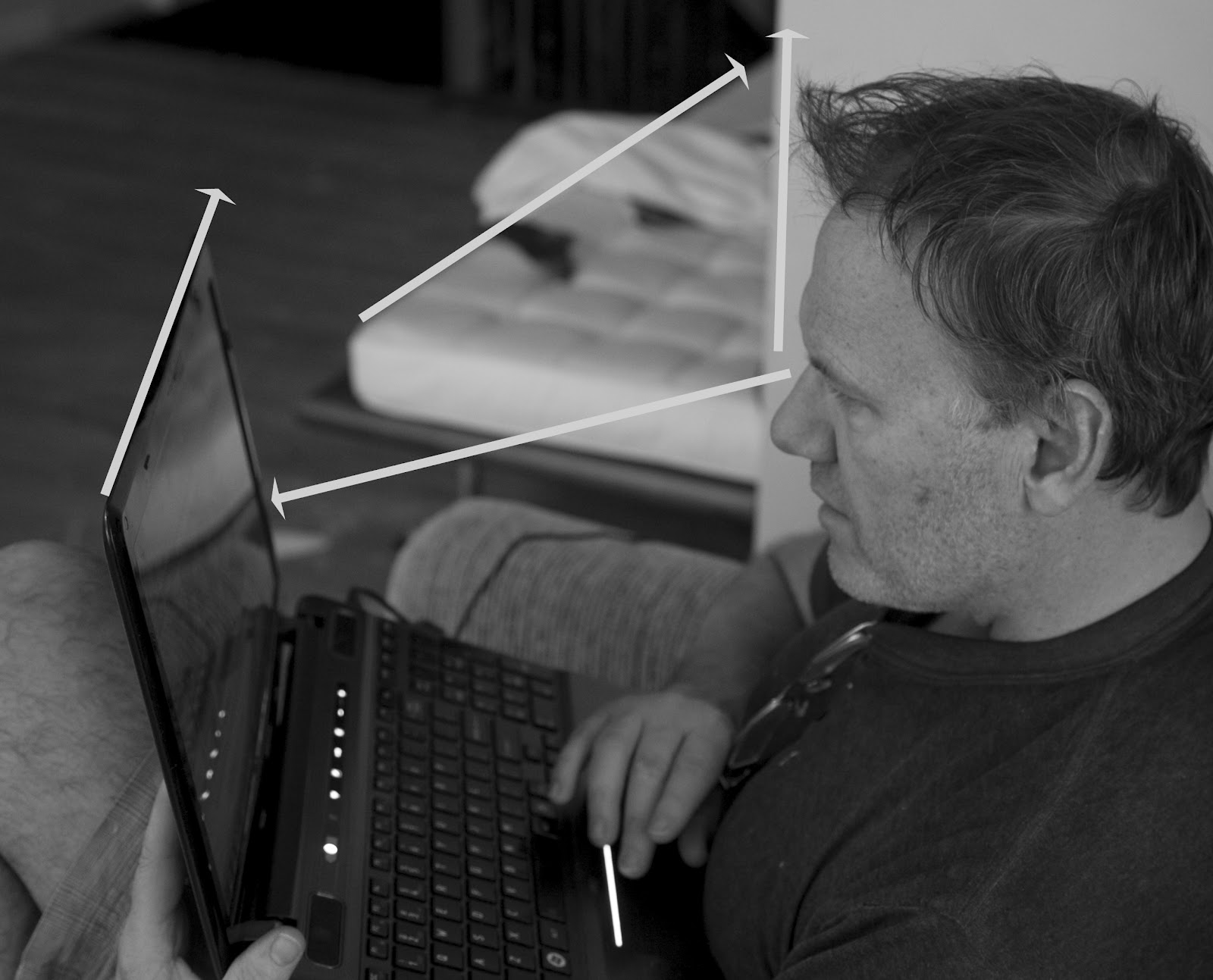
photograph 2. The implied "eye" line gaze draws our attention in a diagonal line to the laptop. In the background the side of the day-bed forms another diagonal.    
Conclusion:  Reflecting on the exercises above, I now appreciate, how a "suggestion" for eg, in the form of an implied "eye-line"  or an extension of visible movement, can direct a viewer's gaze.  Lines, points, curves and diagonals can be used subtlety to direct a viewer's gaze and add flow and movement to an image. Freeman points out that the use of such graphic elements animates a picture - for example if a line in a picture moves out of the frame, then the eye naturally moves back to see more - this creates tension and activity (2).  
 

(1) http://en.wikipedia.org/wiki/Gestalt_psychology accessed 26/09/12)
(2) Freeman, Michael, (2007), the Photographer's Eye: Composition and Design for Better Digital Photos, The Ilex Press, p 44

Tuesday 25 September 2012

Martin Parr


I first became aware of Martin Parr, when I accidentally inherited a book exhibiting works by  Magnum Photographers.    I flicked through the pages, and what struck me about Parr's work was firstly the humours images of the public at the seaside, and secondly the very vivid use of colour and close crop- which stood out against the other images which were mostly black and white.
 
Cotton(1) suggests that Parr pushes the bounds of documentary photography, in that he combines intimacy and satire like no other photographer. Parr captures intimate moments which occur in the nitty gritty of everyday life, he puts his subjects under a microscope allowing them to act naturally in their own environment.   Through this  Parr, has the ability to convey the loaded meaning in a captured glance or ordinary sequence of events.   Many of Parr's images have a  unique British anthropological feel to them recording moments in the great British tradition which he states  are sadly dying out. One image I particularly like is a close up of a chequered table cloth in a greasy spoon cafe. There is something quintessentially British about this.    Being British, this is something that strikes a chord! we just get it!    I love the satire evoked in looking at ordinary people in their own environment. One such photograph which springs to mind, is the image of the woman sunbathing (Parr's - euro watching, Benidorm, Spain, 1997) - the image is (unintentionally?) humorous - and is a great example of Parr's use of vivid colour.      To achieve this Parr,  often uses a macro lens to focus in close on his subject. This combined with the use of flash and high saturation produces, his unique trade mark.
 
The following articles illustrate Parr's work - and the interview, through Lens Culture is rewarding to listen to.


the above image of the sunbather was the one that first grabbed my attention in my Magnum book.  It has to have been one of the influential factors in the British TV series, Benidorm.
 
Conculsion
Parr's images are striking and valuable in that they are an anthropological comment on elements of society, which in some cases are disappearing.  His images also illustrate how effective it is to use highly saturated colours to convey a message or highlight elements of behaviour.
 
 
images courtesty of Martin Parr accessed through Lens Culture at
 
 
http://www.telegraph.co.uk/culture/photography/6349041/Martin-Parr-Parrworld.html?image=12 (accessed 02/0912)
http://www.martinparr.com/index1.html  (accessed 6/9/12)
http://www.lensculture.com/parr.html  (accessed 25/09/12) ( -interview with Jim Casper
 well worth a look)


(1)Cotton, Charlotte, (2009). The Photograph as Contemporary art (2nd revised ed), Thames and Hudsen, p 183

Monday 24 September 2012

Exercise Curves

Exercise Curves.

Curves have a sense of grace, elegance, movement and direction. Curves are similar to a diagonal because they pull they eye in one direction.  Freeman, comments that curves are a useful second device in the controlling the way in which the viewer looks at a photograph. He states that curves are harder than diagonals to compose, and whilst a diagonal is straight line of any direction that is altered by viewpoint, and curve must usually begin as a real curve. (1)

The following photographs use curves to express, elegance, movement and direction:
 
 
1. the curve in this photograph is almost like a diagonal, it draws the eye in whilst moving the viewer around the frame in a smooth curve - this example also highlights perspective drawing the eye into the distance. I shot this vertically to enhance the curve - the image is more dynamic with the curve taking up most of the frame.

 2. the petals form natural curves, expressing movement from the centre of the stem outwards and around the frame. The curves are elegant, smooth and movement flows around the outside of the flower as well as from the centre point. The diagonal stem works well too, to enhance the dynamic design elements in the image.

 
 3. the Lilly pads floating on the pond are each elegant circles, but they also represent a curve emanating from lower right to top left and then middle in the way they float naturally. I decided to crop this image closely to enhance the perspective and the curve shape is similar to a diagonal in that it draws the eye in one direction of movement.

 
4. the building here is curved and expresses movement which is highlighted by the strong curve (almost diagonal) directing the gaze from the top left hand of the frame around into the centre - the movement is unresolved as it disappears out of view, suggesting a tension and dynamic qualities. 
 
conclusion

I find curves atheistically pleasing - they are elegant, graceful and smoother than diagonals. Whilst completing this exercise, I was reminded of Part One of the course, and the exercises on balance, a curve is a strong graphic element which can direct the gaze around the frame. It is interesting to see how curves create dynamic tension, pulling the eye around the curve in the direction of the flowing movement. One of the most simple examples of this, is the "S" shaped path by Brassi (which I featured supra) taken from http://www.atgetphotography.com/The-Photographers/BRASSAI.html (accessed 9/9/12).  See how the "S" shape draws the gaze from the lower left hand side of the frame, and pulls the eye in a curve up to the top of the frame giving a gentle elegant dynamic flow to the image.


Freeman, Michael, (2007). The Photographer's Eye: Composition and Design for Better Digital Photos, The Ilex Press.

Thursday 20 September 2012

Exercise Diagonals.


Exercise: Diagonals

We were asked to take 4 photographs which use diagonals.  One thing I have noticed whilst doing this exercise, is that it is easy to create diagonals by canting the frame.   Diagonal lines produce movement, dynamism .. they are highly active.. and bring life into the picture because they represent unresolved tension (1).


1. there are parallel diagonals here, the branch going left to upper right and the individual leaves forming diagonals off the branch.

2. again in this image, depending on the cant of the frame, parallel diagonals (I have tipped the frame slightly to highlight the contrast of vertical and diagonal).


3. movement is present, the columns form diagonals in one direction, whilst the top diagonal line of the building pulls the eye in another direction demonstrating unresolved tension.

4. I spotted this diagonal shadow forming across the bottom of the statue -
5. the staircase is a natural diagonal, I originally canted the frame to get an abstract view of the tower, in doing so, the tower itself creates a diagonal suggesting movement, perspective and depth.


Conclusion:

Horizontals and verticals  lines produce stability which arise from their symbolic associations with gravity. Diagonals have a stronger sense of movement and expression.  As I experienced in this exercise, diagonals can be created in the viewfinder by canting the frame - as Freeman notes, this ability means that they are much more under the control of the photographer(2).   Diagonals emphasise depth and distance, I have looked back through the early exercises in Part One, and noticed that I had quite a few diagonals emphasising depth and distance. I am now able to appreciate that diagonals form strong graphic points of reference, or movement.
Reflection:  whilst, participating in these exercises, I have been inspired to read about Cubism and its response to the Renaissance order of painting. I have always liked Mondrian, especially his later works, with lines and three colours. I am now able to understand a bit more about the graphic qualities in his drawings.  http://www.theartstory.org/artist-mondrian-piet.htm, and http://www.moma.org/collection/provenance/provenance_object.php?object_id=79879.


(1)Freeman, Michael, (2007). The Photographer's Eye: Composition and Design for Better Digital Photos, The Ilex Press. p 76 -77
(2)Freeman, Michael, (2007). The Photographer's Eye: Composition and Design for Better Digital Photos, The Ilex Press. p 76 -77


Tuesday 18 September 2012

Part Two: Black and White

Converting to black and white:

As recommended by Freeman in Part Two of the course materials at page 71, it may be helpful to tackle this part of the course in black and white. The rationale is, that our attention is more focused on the graphic elements of the picture when the image is shot in or later transferred to black and white. As you can see with my exercise on single points, the greenstone is very vibrant, and the colour itself (although  it serves as a point) a monochrome image would help the viewer to focus more on the graphic elements in the composition.
 
I never actually set out to photograph in black and white, but occassionally,as a post production strategy convert colour to grayscale. A well crafted black and white image tends to bring out the tones, contrasts, and is much more dramatic than a colour shot. Freeman(1), in http://thefreemanview.com/observations/when-black-and-white/(2) -  gives a quick overview about when to use black and white. I think the main point too, is to shoot in colour and then convert to black and white otherwise the camera's processor will throw away valuable information that you could use to edit your image.
For example, I am working with Camera Raw and I alter the hues/saturation channels before converting to grayscale.  At the moment I am merely experimenting with what looks good. 
 
 
Some of my images which have appeared extremely dull (shot on a grey day) have been more effective once converted to black and white. I guess it is the sense of drama. I am not too certain though, that I have mastered the technique of getting the right blend of tones when I adjust my colours before converting to grayscale. I guess it a matter of personal preference but I need to do some online research into the various techniques for adjusting tones.
 
I converted this photograph of bamboo to black and white, and in doing so, the contrast of tones really stood out. The colour image was fine, but the verticle lines stand out more in black and white.


This is a photograph by Toshihiro Oshima which I accessed from http://www.digitalrev.com/article/toshihiro-oshima-virtuoso-of-visual/NTY4NA_A_A. (accessed on 8/9/12)   His black and white work is amazing, full of drama and very soulful. This composition highlights the contrasting tones of the white kimono and the shadowy background.
 
(1) Freeman, Michael,(2007).The Photographer's Eye: Composition and Design for Better Digital Photos, The Ilex Press, page 126
(2)http://thefreemanview.com/observations/when-black-and-white/ (accessed 7/9/12)